🎯 Perfect Your Picture, Perfect Your Sound!
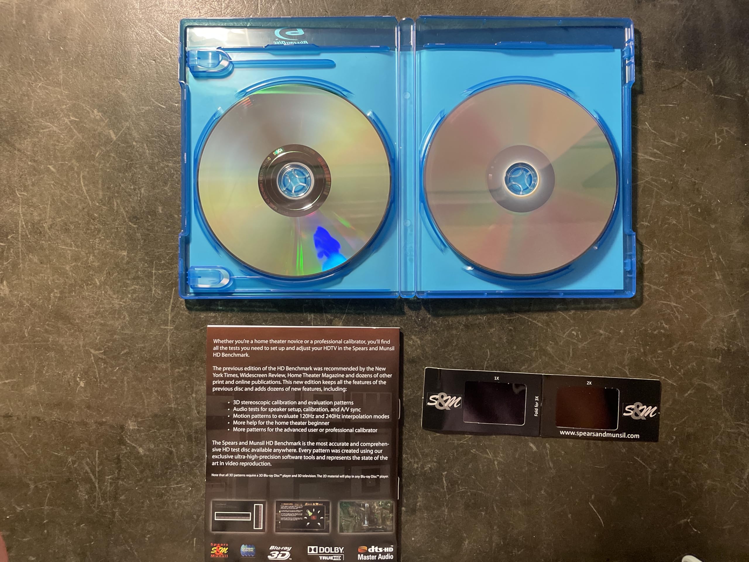
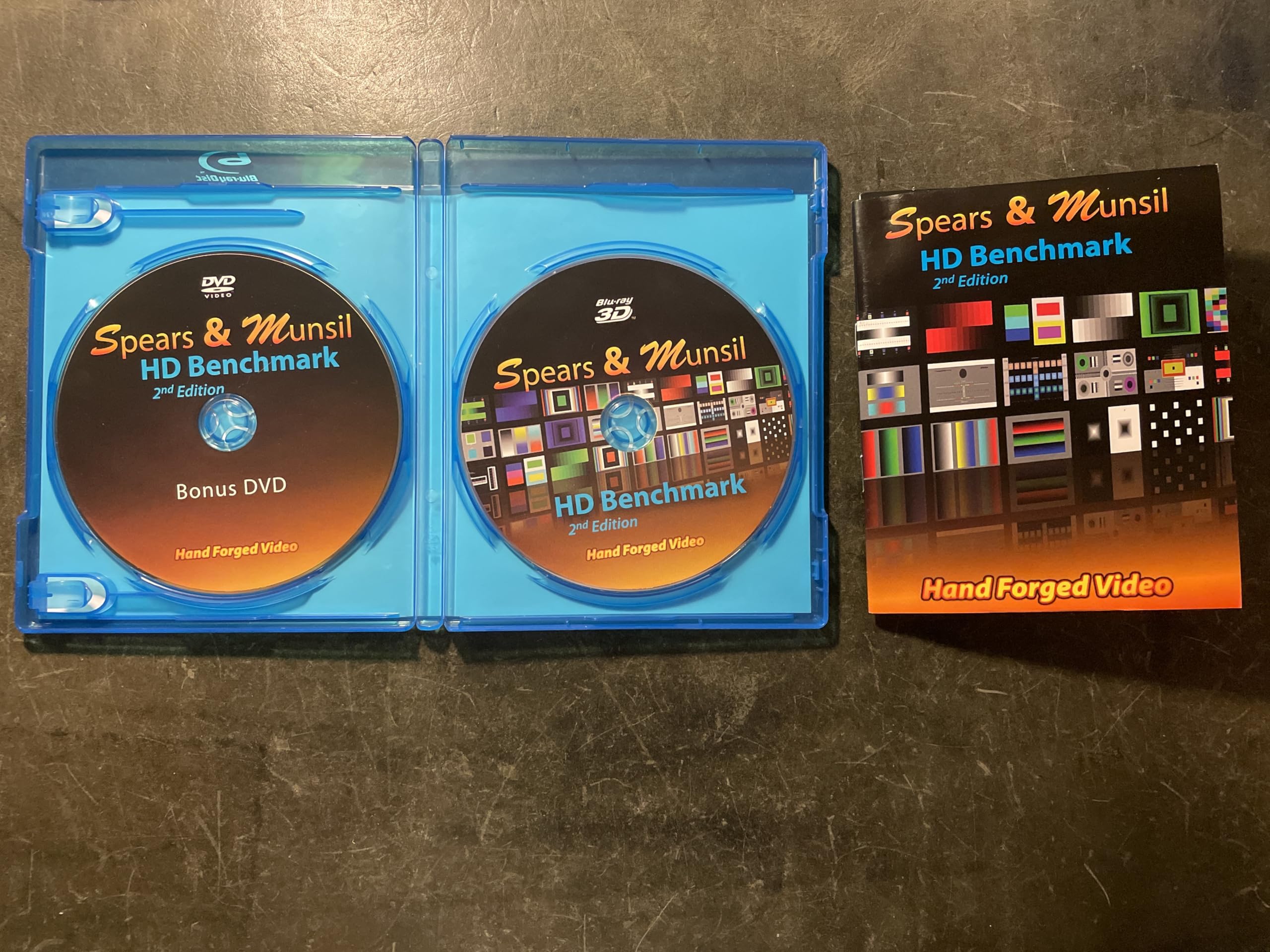
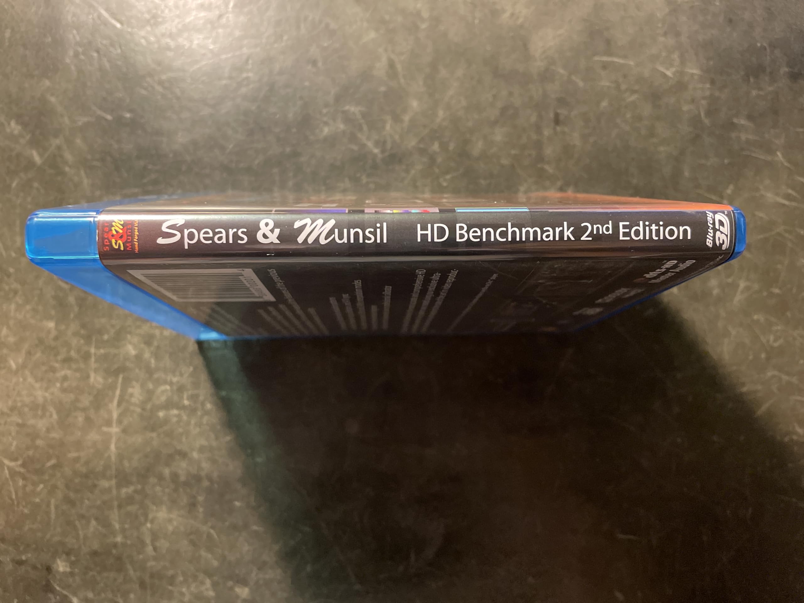
The Spears & Munsil HD Benchmark and Calibration Disc 2nd Edition is an essential tool for anyone looking to optimize their home theater experience. Featuring advanced 4K HDR test patterns and comprehensive audio calibration tools, this disc is designed for both professionals and enthusiasts. Its user-friendly interface makes it easy to navigate, ensuring that you can achieve the best possible performance from your AV setup.
C**A
Get your HD, or even 4K TV, "Aligned" with This Terrific Resource!
For about ten years, I've been aware of the calibration Blu Ray with the funny name, but didn't have the machine or the knowledge of where to obtain the disk.Long story short: I was at my city's recycling yard, and I crossed paths with a woman who was carrying two identical LG Blu Ray decks to the electronics trailer. I waved to her and asked if I could have one , and she said "Sure, help yourself!" What are the chances of someone dropping off two identical Blu Ray players, both with remote controls! She said her family "no longer popped disks into machines, we stream everything movie-related now", and that both machines were in perfect working order.So I brought one home, HDMI'd it into my Samsung LED TV, and a few months later, finally bought the Spears & Munsil Benchmark 2nd edition disk here.I went through the steps of adjusting all the basic settings(brightness, contrast, color, sharpness, etc.) and checked the gamma.I tell you this: Aligning the settings on my flat screen with this disc was like taking a blurry binocular with grimy lenses and cleaning them off and focusing them! People and other subjects appear as thought they are right in the room with me!The patterns are grouped logically in the menu to the left, with more basic adjustments at the top, and more detailed, nuanced patterns lower down. I was even able to center the picture in the frame(it was a couple pixels down and to one side). Hint: select picture size "Just" or "Screen Fit"(on Sammys)I may have only a 40" flat screen in my apartment, but it looks better and seems to have a picture more accurate than on newer or bigger OLEDs, QLEDS and even 2K and 4K sets!Get yourself this disk, and align at least the basic settings on whatever you watch TV/ smart TV on.Yes: Calibration is exactly like "wheel alignment for your TV". You'll never view TV the same way again, whether it's cable, broadcast, smart hub apps like YouTube or Netflix, or even standard DVD or VHS!Because leaving your existing or new TV in factory settings/Vivid/Dynamic is a terrible thing to do - for the set and for your eyes!
A**S
Needed some more hints, which I provided, but worth it for the color settings and player setting suggestions.
I thought this was gonna be great. But the dolby digital set up that comes with some dvds as special features are actually just as good, but here they give you the glasses to make sure the blues and magentas are correctly displaying. They need to work on back lighting and brightness more, separating the two better in the tests. Back lighting, I found, was not covered very well anywhere, So to make the most of this setup, I'm going to give you some pointers...1. First, set your devices, both the player and your tv too, on cinema or movie mode, and leave them there.2. On the player, use enriched and enhanced rgb settings.3. Back lighting: On the tv, have a wide screen movie on with black bars on the top and bottom. Now, make sure you have a dark scene on pause, so that you can match the dark bars with the black parts of the movie. Set your back lighting to lower settings until you dim the dark spots or shadows in the scene down to equal or just below equal darkness with the black bars showing on top and bottom of the paused movie scene. Now play it a bit and make sure the bars are the same or the tiniest bit darker than the black scenes and shadows in your movie. Now you have your back lighting set up right, and everything will be easier to set up afterwards, and it will extend the life service of your tv's screen.4. Go directly to the cyan blue/magenta test. Use your glasses. My tv had to have the glasses folded twice, as the disk warns you for some tvs, and it worked really well. My color settings were not red enough.5. Brightness. Now is the time to set your brightness levels. Make sure you can see all the details of the squares. It may look dimmer, but trust me, your eyes will thank you for it later, as it not only spares the eyes from seeing a glaring screen at full blast, it helps them to see sharper details in the pictures and videos easier, which also reduces eye strain, and actual headaches. (P.S. I researched the crap out of this just to get my tv looking like the older model lcds did. I miss that tv. Next...6. Sharpness and contrast. You can not, in any way, set these independently. One will always affect the other. Let us first set Sharpness and contrast both to 0, zero, yes, zero. Why? Sharpness is an artificial way to make edges look sharper by adding angles and lines to the picture. If you have an hd tv, then each pixel the tv is sent, is already on the disk. If it is a high quality movie, then each dot is already set at its proper appearance. However, that being said, not all films are that great, even blu-rays, so it does help to up the settings a bit. After we set sharpness and contrast to zero, We find a scene in a movie that is well lit, where you can see a face close up, or better yet, an object, such as a stone carving, or a close up of some grasses. I mean really close up. This is very important. Your close up scenes of faces are what your eyes are going to be judging the clarity on anyway, so faces are good, and easy to find in your movie. However, I started with the opening scene in Stargate, blu-ray, remastered, and was looking for a face, when I found the rock carvings to be a perfect place to fine tune the settings. I turned sharpness up until it looked nice, not perfect. As soon as artifacts and lines became too edgy, I turned it down a bit. You are done there, perfectly done. It won't seem right, but in a few seconds it will.7. Contrast. Contrast is the difference between the light and dark areas in the picture. Contrast should never be set high, it will make your scenes look like spot lights are glaring off of faces and give everything an artificial feel and you actually lose a lot of detail by doing that. So find a face, or a carving, or close up nature picture, pause it, and set contrast up a little, mine was 30 out of hundred, and each little step of the way, you will see sharpness become pin point accurate! for real. There you go. Now your disk was worth the money. :-)
TrustPilot
1 个月前
1天前